
New College Hill Community Logo
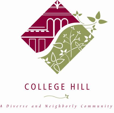 On August 2, 2005, the College Hill Urban Redevelopment Corporation (CHCURC) unveiled a new College Hill Logo to the community.
This logo was designed to create a vibrant, active, recognizable image reflecting the community's rich history, its natural and architectural surroundings and its diversity.
The two halves of the logo represent College Hill's nature and architecture . The curve in the middle represents Hamilton Avenue as it comes up the hill and shows that College Hill is progressive and moving towards the future. The leaves breaking out of greenery imply that the community is expansive and inviting new growth. The architectural elements represent the character and history of College Hill. The two halves merging on a common path represent the community working together and shows openness to change. The tag line reinforces the most-loved positives of College Hill, that it is a "Diverse" and "Neighborly" community.
The logo was developed by CHCURC's Identity Committee led by Don Cluxton. To learn what College Hill means to its residents and business owners and what they like most about their community, the committee distributed surveys and conducted focus groups throughout the community. They then worked with Cincinnati's graphic design department to create the final design, which was unanimously embraced by the CHCURC Board.
CHCURC's goal is for this unique logo to appear on all public notices, way finding signage and public structures, as well as community web sites, newsletters and letterheads. A Standards Guide for the College Hill Logo and Identity System is available from CHCURC.